Last Updated August 14, 2024
Mobile-Friendly Website: Tips for Responsive and User-Friendly Design
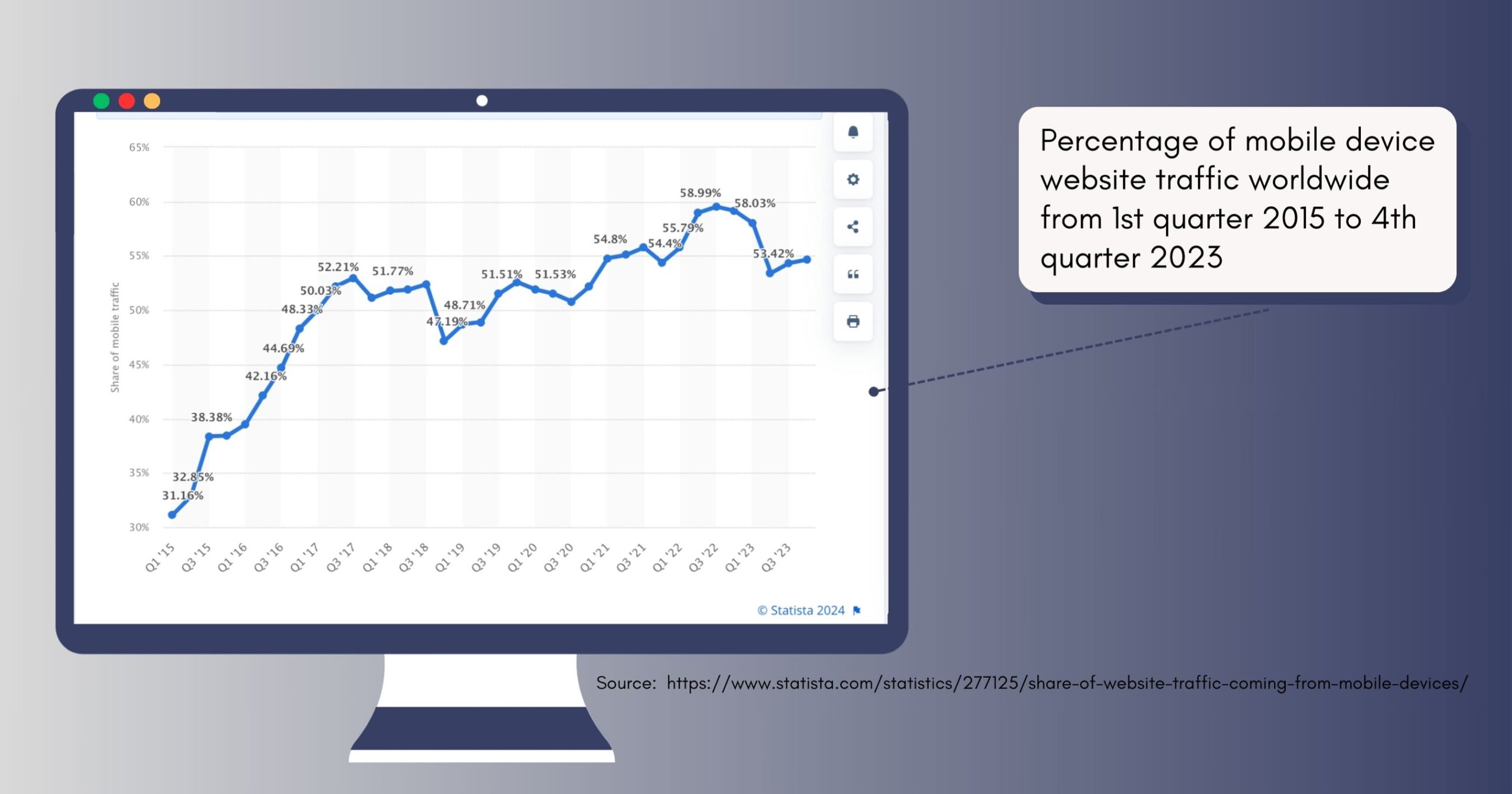
With almost 60% of internet users accessing the web through mobile devices, businesses that fail to optimise their online presence for mobile risk losing a significant portion of their target audience. This article will equip you with the best practices and tools necessary to create a user-friendly, responsive website that captivates your mobile audience.
We’ll also explore the tangible benefits of mobile optimisation, including improved search engine visibility, boosted conversion rates, and enhanced user engagement. You will also learn insights into key strategies such as prioritising a mobile-first approach, optimising for voice search, leveraging mobile-friendly plugins, and ensuring seamless performance across various devices and the impact of mobile-friendly design on SEO, providing actionable tips for optimising content, images, and navigation for mobile indexing.
So let’s get started.
Benefits of a Mobile-Friendly Website
- Enhanced User Experience: Mobile-friendliness ensures a smooth experience for visitors on smartphones and tablets. This means effortless navigation, optimized readability, and clear visuals for easy touch interaction, all leading to reduced bounce rates and higher engagement.
- Improved Search Engine Visibility: Search engines prioritise mobile-friendly sites. This translates to higher ranking in mobile search results and reduced bounce rates, both factors that can positively impact your overall search ranking. In 2018, Google started using mobile-first indexing as its primary method of indexing new websites, meaning they rank the mobile version of websites first before looking at the desktop version.
- Boosted Conversion Rates: A mobile-friendly website allows users to complete actions like purchases or sign-ups directly from their phones. This frictionless experience increases conversion rates and sales potential.
These benefits showcase the significant impact that a mobile-friendly website can have on user experience, search ranking, and overall conversion rates. Investing in a responsive website yields substantial returns in terms of user satisfaction and business success.
Moving forward from these remarkable benefits of a mobile-friendly website, let’s now explore the importance of crafting content tailored specifically for mobile devices.
Factors to consider in Mobile friendly web design
Responsive Design and Adaptability to different devices

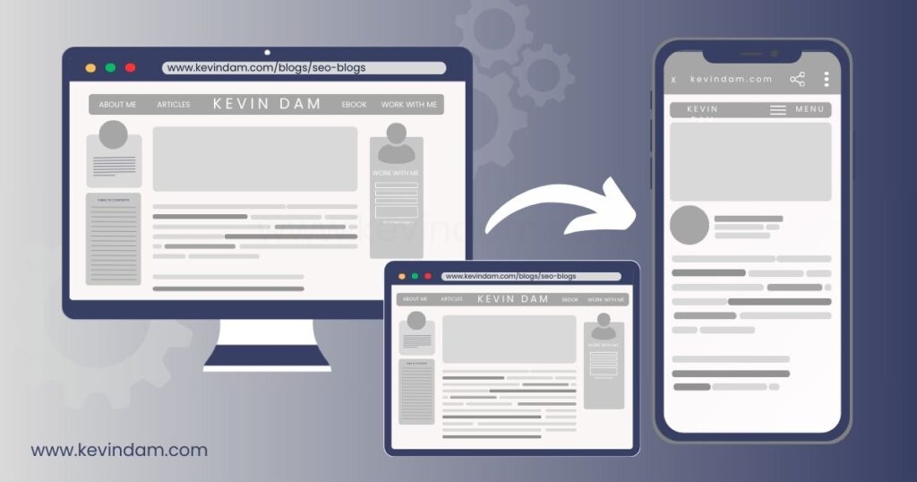
Responsive web design has become the standard for successful web development. It involves creating interfaces that automatically adjust to fit the screen size and resolution of the device being used. To achieve this, we must consider the unique characteristics of each device and customise the user experience accordingly.
Here’s how responsive design works:
- CSS Media Queries: These are the secret sauce of responsive design. They’re essentially lines of code instructing the website to adjust its layout based on specific screen size conditions. This means that whether someone is accessing your website from a desktop, tablet, or smartphone, they will see a version of the site that is optimised for their specific device. For instance, a media query might instruct the website to switch from a two-column layout on a desktop to a single-column on a mobile device.
- Flexible Grid Systems: Consider a grid system as the website’s underlying structure. Responsive design utilises flexible grids that resize and rearrange elements based on the available screen space. This ensures that images, text, and navigation elements maintain proper proportions and readability across different devices.
- Fluid Images and Videos: Gone are the days of static images that break layouts on smaller screens. Responsive design utilises fluid images and videos that automatically scale to fit the available space without compromising quality.
Google prioritises mobile-friendly websites in search results, so responsive design isn’t just about user experience—it’s also about ensuring your website ranks well and stays ahead of the competition.
Optimising Load Times

On a mobile device, the frustration of waiting for a webpage to load can be even more pronounced because people expect quick answers when they search on their phones. Slow load times increase the likelihood of users abandoning your site.
To mitigate this issue, make sure to:
- optimise images and videos for faster loading
- minimise unnecessary code and scripts
- utilise browser caching
- consider using progressive web apps (PWAs) for offline functionality.
These strategies enhance the loading speed, allowing users on mobile devices to access your content more quickly.
User-friendly navigation and intuitive interface

A responsive user experience means visitors can easily find and interact with content on your website regardless of the device they’re using. No more squinting or pinching to zoom in just to read something. When users have a smooth experience, it leads to higher satisfaction and an increased likelihood of returning to your site.
Here’s why intuitive navigation and a clear interface are essential:
- Reduced Friction: Intuitive navigation can feel like a maze with a single clear exit for users. They can find what they need quickly, minimising frustration and keeping them engaged. Complex navigation menus or unclear layouts lead to confusion and lost users.
- Building Trust and Confidence: When users encounter familiar patterns and intuitive interactions, they feel confident navigating the website. This fosters a positive user experience, making them more likely to return and recommend the app.
- SEO benefits: Search engines, like Google, prioritise mobile-responsive websites when delivering search results. This means that having a responsive website boosts your chances of appearing at the top of search engine results pages (SERPs), driving more traffic to your site.
A seamless transition from desktop to mobile also offers consistency in branding and messaging. This reinforces your brand’s credibility and professionalism since users will associate positive experiences with smooth interaction on any platform—be it desktop, tablet, or mobile.
Image Dimensions
A high-resolution image that looks stunning on a large monitor can take longer to load on a mobile device, resulting in a poor user experience. Resizing images to be tailored for smaller screens ensures they load quickly without losing quality. This process not only improves the overall performance of a website but also aids in maintaining visual appeal across different devices.
Employing techniques such as responsive images, which adjust automatically to the screen size, can significantly contribute to a smoother and more efficient mobile user experience. Adopting next-gen image formats such as WebP, JPEG 2000, or JPEG XR is becoming increasingly important for mobile-optimized websites. These formats offer superior compression and quality characteristics compared to traditional formats like JPEG or PNG, allowing for the same quality images at a fraction of the filesize.
Incorporating such formats can drastically reduce the amount of data that needs to be loaded, further speeding up mobile page load times. Web designers and developers must prioritise these adjustments, ensuring their websites can cater effectively to the growing mobile user base without compromising speed or aesthetics.
Key Strategies for mobile-friendly website optimisation
Mobile-first approach
In 2015, Google announced that mobile-friendliness would be a ranking factor for search results. Fast forward to today—Google has officially rolled out its mobile-first indexing, placing even more emphasis on the importance of mobile-friendly design.
Mobile-friendly websites have a significant advantage in search engine rankings, as they provide a better user experience and reduce bounce rates. Additionally, a mobile-friendly website is more likely to load faster, which is crucial for capturing the attention of users on the go.
Prioritising Content for Mobile Indexing
The experience of a user visiting a website on their phone should be as good as if they were using a computer. This means your text needs to be easy to read, your images should look great without taking forever to load, and the buttons need to be big enough to tap even with the tiniest of fingers.
Here are some key factors to consider when optimising content for mobile:
| Key Factors | Description |
| Concise and Scannable Text | Break up the text into small, digestible paragraphs and use clear headings and bullet points. |
| High-Quality Images | Optimise images for mobile by using high-quality images with smaller file sizes for faster loading. |
| Clear Call-to-Action | Make buttons prominent, easily clickable, and clearly labelled so users know exactly what they’re clicking on. |
By understanding and implementing these important aspects of mobile-optimised content, you can truly deliver a seamless and enjoyable experience for mobile users—essential for building engagement and trust, and ultimately driving conversions on your website.
Voice search optimisation

The way people articulate queries through voice significantly differs from traditional text searches, making it imperative for website owners to optimise for this emerging trend.
Here’s how optimising your mobile website for voice search can give you an edge:
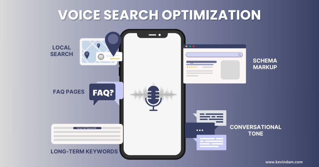
- Use of Schema markup to provide context to your content: Search engines use website structure, including schema markup, to understand your content. Proper markup helps search engines understand what your website is about, making it more likely to be surfaced in voice search results.
- Think Local: Since many voice searches have local intent (e.g., “find a dentist open now”), local SEO becomes even more important. Ensure your website’s NAP (Name, Address, Phone number) is consistent across the web and optimise your content for local keywords.
- Long-tail keywords: People speak in questions when using voice search. Long-tail keywords are often phrased as questions, mirroring how someone would naturally ask something like “What are the best hiking trails close by?” This increases the chances your content will be relevant to their search.
- Speak the User’s Language: Write your website content in a conversational tone, mimicking how people speak naturally when asking questions. Use more everyday words (like “I,” “you,” “we”) and avoid using complicated jargon or technical terms. This increases the chance of your content matching a user’s voice search query.
- Build FAQ pages: Since voice search queries are often phrased as questions in natural language, a well-designed FAQ page with the right questions and answers can directly address what users are looking for. Keep your FAQ answers concise and to the point, providing the most important information in a clear and easy-to-understand way.
Utilise Mobile-Friendly Plugins
Selecting and integrating mobile-friendly plugins and tools is essential for enhancing mobile usability and improving user experience. It can be as simple as a mobile-friendly slider that displays content in an engaging way on small screens or a contact form that is easy to use on touch-based devices.
Let’s explore how these plugins can be your secret weapon:
- Navigation Made Easy: Complicated menus are a nightmare on small screens. Plugins like Superfly or WP Mobile Menu can help you create user-friendly, responsive menus that adapt to any device, ensuring smooth navigation for your mobile visitors.
- Image Optimization on Autopilot: Large image files can slow your website, especially on mobile data connections. Plugins like Smush can automatically optimise your images, reducing their size without sacrificing quality. This leads to faster loading times and a smoother user experience.
- Speaking the Language of Speed: Speed is king in mobile. Plugins like Autoptimize or Hummingbird can analyse your website and suggest ways to improve its performance. These might involve minifying code, caching resources, or enabling compression techniques, leading to a faster, more mobile-friendly experience.
- AMPing Up Efficiency: The Accelerated Mobile Pages (AMP) framework is a Google-backed initiative for creating lightning-fast mobile web pages. Plugins like AMP for WP can help you easily integrate AMP functionality into your website, ensuring your content loads near-instantly on mobile devices.
- Accessibility features: Accessibility should be a priority for any website. Plugins can help you implement accessibility features like clear labels, high colour contrast, and text-to-speech functionality. This ensures your mobile website is inclusive and usable for everyone.
Choosing the right plugins depends on your specific needs and website platform. Do your research and experiment to find the perfect combination to optimise your mobile design. utilising plugins that are specifically designed to enhance mobile functionality and responsiveness can provide seamless integration with your existing website while catering to the diverse needs of mobile users.
Key Priorities When Testing for Mobile Responsiveness
When it comes to ensuring that your website functions flawlessly on a mobile device, testing is important. All interactive features like forms, buttons, and dropdown menus must work just as smoothly on a mobile as they do on a desktop.
Here’s how to prioritise your mobile responsiveness testing efforts:
1. Focus on Core User Flows and Functionality:
- Identify the most critical functionalities and user journeys within your app or website. These could be actions like login, product purchase, or content search.
- Prioritise testing these core user flows across different screen sizes and device orientations – portrait and landscape.
2. Target Popular Devices and Browsers:
- While testing everything is ideal, resources might be limited. Focus on the most popular device and browser combinations used by your target audience.
- Analytics data can provide insights into these trends. Common choices include iPhones, Android devices, and popular browsers like Chrome and Safari.
3. Responsiveness of Visual Elements:
- Test how images, videos, and other visual elements adapt to different screen sizes. Ensure they don’t become blurry, pixelated, or overflow the screen.
- Verify proper alignment and responsiveness of text content. Fonts should be readable and sized appropriately for mobile viewing.
4. Prioritize User Interaction:
- Test the responsiveness of buttons, menus, and other interactive elements. These should be easily tappable and function as intended on mobile devices.
- Ensure proper hit areas for touch interactions, considering the limitations of finger-based navigation compared to mouse clicks.
5. Test for Performance:
- Mobile users are more likely to abandon slow-loading pages. Test website loading speed across different devices and network connections (WiFi vs cellular data).
- Consider image optimisation techniques and leverage caching mechanisms to improve mobile website performance.
Additional Tips:
- Utilise a combination of real device testing and emulators/simulators to gain a comprehensive understanding of responsiveness across various platforms.
- Accessibility should be a priority. Ensure your mobile interface adheres to accessibility guidelines for users with visual impairments or other disabilities.
There are tools available to help us assess the user-friendliness of our website on mobile devices. Utilising tools like Google’s Mobile-Friendly Test and PageSpeed Insights will give you a detailed report outlining the aspects that are functioning seamlessly and the areas that may require attention. These reports shed light on specific facets necessitating improvement to ensure an optimal user experience for those accessing our site via mobile.
By focusing on these key priorities, you can ensure your mobile responsiveness testing efforts deliver the most value. A well-tested and responsive mobile experience translates to a happy and engaged user base as people aere becoming more increasingly utilising mobile phones more than their desktops.
Conclusion
From enhanced user experiences that foster engagement and reduce bounce rates to improved search engine visibility and higher conversion rates, a mobile-friendly website is a powerful asset for any modern business. By prioritising responsive design, optimising content for mobile indexing, and implementing strategies like voice search optimisation and mobile-friendly plugins, you can ensure your online presence remains relevant and accessible to the growing number of mobile users.
However, it’s important to remember that mobile-friendly website design is not a one-time endeavour. As technology continues to evolve, user behaviours and expectations shift, and search engine algorithms adapt, businesses must remain vigilant in their efforts to stay ahead of the curve. Regular testing, performance monitoring, and continuous optimisation are crucial to maintaining a seamless mobile experience that not only meets but exceeds the expectations of your target audience.
By embracing the principles and strategies outlined in this guide, you’ll be well-equipped to navigate the mobile-first landscape, captivate your audience, and drive sustainable growth for your business in this digital age.
